Can Your Kitchen Wall Color Help You Lose Weight?
Most weight-loss plans focus on food and workouts—but the space where eating decisions happen matters, too. Nearly half of U.S. adults report trying to lose weight in a given year, showing how common (and challenging) the goal is.
Kitchen wall color won’t “burn fat,” but it can shape mood, focus, and how tempting food feels in the moment. Some studies suggest that lighting color—especially blue-toned lighting—can even reduce how much people eat in certain situations.
In this article, you’ll learn which kitchen colors tend to feel calming vs. appetite-stimulating, how to use color strategically without making your kitchen feel cold, and when it’s worth calling a pro painter for the best result.

Why kitchens trigger cravings
Kitchens are built for convenience: snacks are visible, portions are easy to “eyeball,” and habits run on autopilot. Environmental cues—like brightness, contrast, and color temperature—can influence perception and behavior, including how appetizing food looks.
That’s why a kitchen refresh can help support mindful eating: it reduces “impulse energy” in the room and makes intentional choices easier to stick with.
Can wall color affect appetite?
Color can influence emotion and perception, which can change how strongly food grabs attention. While research results vary, evidence suggests lighting color can affect meal size—one study found blue lighting reduced the amount eaten in men compared with yellow and white lighting.
So, think of paint color as a small behavioral assist: it can help create an environment that supports better routines, but it won’t replace nutrition, activity, sleep, or medical guidance.

Best colors for a “less snacky” kitchen
The goal isn’t to make your kitchen uninviting—it’s to make it feel clean, calm, and intentional.
Soft blues (blue-gray, dusty blue)
Blue is often associated with calm, and blue-toned lighting has been shown to reduce intake in some settings. If your kitchen already has warm cabinets or flooring, a muted blue-gray wall can balance the warmth without feeling sterile.
Try this:
-
Walls: soft blue-gray
-
Trim: crisp white
-
Accents: navy or slate (small doses)
Muted greens (sage, eucalyptus)
Green reads as “fresh” and pairs naturally with plants, wood, and natural textures, which can reinforce a healthier kitchen feel. Sage or muted greens also stay timeless and resale-friendly compared to trendy neon tones.
Try this:
-
Walls: sage green
-
Decor: light wood + white ceramics
-
Hardware: matte black or brushed nickel
Cool, light neutrals (off-white, light greige)
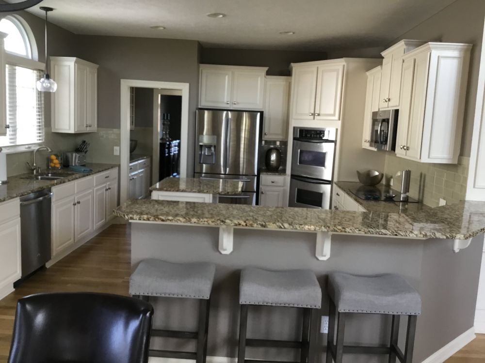
Light neutrals keep the room bright and reduce visual intensity—helpful if you want your kitchen to feel orderly and not overstimulating. They also work well if you plan to add blue/green accents through décor instead of committing to a strong wall color.
Try this:
-
Walls: warm off-white or light greige
-
Accents: blue dish towels, green plants, glass jars
Colors that can increase appetite (use carefully)
These colors aren’t “wrong,” but they can create a higher-energy environment where cravings feel louder.
Strong reds and oranges
Warm, intense colors are widely used in food contexts to grab attention and create excitement. In a home kitchen, that energy can be fun for entertaining—but less ideal if the goal is fewer cravings and less snacking.
Better approach:
-
Keep red/orange as a small accent (artwork, bar stools, a rug) instead of full walls.
Bright yellow
Yellow can feel cheerful and lively, but a high-saturation yellow can also make a space feel “busy.” If you love yellow, use softer buttery tones or limit it to décor so the kitchen stays bright without feeling stimulating.
Design tweaks that help more than paint
Paint works best when it’s paired with habit-friendly layout and lighting choices.
-
Upgrade lighting first: lighting color can change food appearance and may influence how much people eat.
-
Reduce visual triggers: store snacks in opaque containers or closed cabinets so cravings aren’t constantly prompted.
-
Keep counters clean: less clutter lowers “visual noise,” making intentional choices easier.
-
Use color in zones: calming wall color + a brighter prep area can support cooking more at home.
When a professional painter is worth it
Kitchens are high-wear: grease, moisture, frequent wiping, and changing daylight can make the “wrong” paint choice look bad fast. A professional painter can help with shade selection (undertones matter), surface prep, and choosing a finish that cleans easily and holds up long-term.
If you’re in the Cleveland area, a local painting team can recommend colors that fit your cabinets/counters and the lighting you actually have—so your kitchen looks great and supports the routines you’re building.
FAQ
Can kitchen paint color actually make you lose weight?
No—paint can’t directly cause weight loss, but it can support mindful eating by shaping mood, focus, and how tempting food feels.
What color is best for reducing cravings?
Many homeowners prefer calmer shades like soft blue, muted green, or cool neutrals; research also suggests blue lighting can reduce how much some people eat in certain settings.
Should I avoid red and orange completely?
Not necessarily—those colors can be energizing, but they’re often associated with higher stimulation in food settings, so they’re best used as accents if cravings are a concern.
If repainting isn’t possible, what’s the quickest alternative?
Swap in calming color accents: blue/green rugs, dishware, curtains, or wall art can shift the feel of the room without painting.
Does lighting matter as much as wall color?
Yes—there is evidence that lighting color can influence meal size and food appearance, so lighting changes can be a high-impact upgrade.